Enterprise Data Visualization Solutions
Transform complex data into intuitive visual insights. Our custom dashboards and visualizations make data accessible, actionable, and impactful for your entire organization.
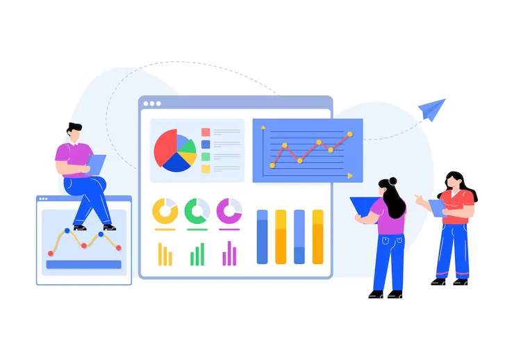
Visualization Expertise
Comprehensive Data Visualization Solutions
We provide end-to-end data visualization services to help you transform complex data into intuitive, interactive visuals that drive informed decisions across your entire enterprise.
Interactive Dashboard Development
Create dynamic and interactive dashboards that empower users to explore data visually, filter results, and drill down into granular details—all through intuitive, user-friendly interfaces. We design dashboards using modern BI and data visualization tools that connect seamlessly to real-time data sources, ensuring up-to-date insights at your fingertips. Users can apply filters, customize views, and interact with charts and tables to uncover trends, spot anomalies, and make data-driven decisions faster. Whether you're tracking KPIs, operational metrics, or customer behavior, our dashboards are tailored to your specific business needs. With responsive design, role-based access, and export options, your team gains a powerful tool to turn raw data into actionable intelligence.
Key Offerings:
- Executive Dashboards
- Operational Analytics
- KPI Visualization
- Multi-device Optimization
Business Intelligence Visualization
Transform business data into visual stories that reveal trends, patterns, and insights that drive strategic decision-making and competitive advantage.
Key Offerings:
- Sales & Marketing Analytics
- Financial Visualization
- Customer Journey Mapping
- Performance Scorecards
Data Storytelling
Craft compelling visual narratives that communicate complex data insights in accessible, memorable ways for both technical and non-technical audiences.
Core Capabilities:
- Executive Presentations
- Interactive Reports
- Visual Explanations
- Guided Analytics
Advanced Analytics Visualization
Visualize complex analytical models, predictive insights, and machine learning outputs in accessible formats that drive understanding and action.
Focus Areas:
- Predictive Analytics Visuals
- Statistical Data Visualization
- Pattern Recognition
- Anomaly Detection
Real-Time Visualization
Deploy real-time dashboards and streaming data visualizations that enable immediate insights and rapid response to changing conditions.
Key Aspects:
- Live Data Streams
- IoT Dashboard Development
- Real-time Monitoring
- Alerting Systems
Why Invest in Data Visualization?
Data visualization is the cornerstone of effective data analysis and communication. By transforming complex datasets into intuitive visual formats, organizations can unlock patterns, trends, and insights that would otherwise remain hidden in spreadsheets and databases. Enterprise data visualization enables teams to quickly understand "What's happening?", "Why is it happening?", and "What actions should we take?"
Key benefits include accelerated decision-making (typically 70% faster), improved data comprehension across all organizational levels, enhanced collaboration through shared visual understanding, and increased analytical ROI. Organizations implementing comprehensive data visualization report 45% improvement in identifying business opportunities and 35% faster time-to-insight compared to traditional reporting methods.
FAQ
Data Visualization Questions
Learn how we transform complex data into clear, compelling, and interactive visual stories that drive understanding and action.
Client Success Stories
Transforming Data into Visual Insights
Hear from our clients who have achieved data-driven transformation through our visualization solutions.
David Roberts
CIO
SPK Technologies implemented a comprehensive data visualization solution that transformed our raw data into actionable insights. For the first time, our team can easily interpret complex data patterns, significantly improving our decision-making processes.
Ready to Transform Your Data into Visual Insights?
Comprehensive Data Visualization & Analytics Solutions
Turn complex data into intuitive, interactive visualizations that drive decisions, identify trends, and reveal hidden opportunities across your organization.